


Have a project in mind? Let’s get to work.
Feel free to reach out if you want to collaborate with us, or simply have a chat.
Book a meeting 

Mostly available during 8AM - 8PM (GMT+7)
Works / WPay
Client:

Zara Benali
Services:
App Icon Design
Website Design
Mobile App Design
Industry:
Fintech
Digital Wallet
Duration:
4 weeks
Overview
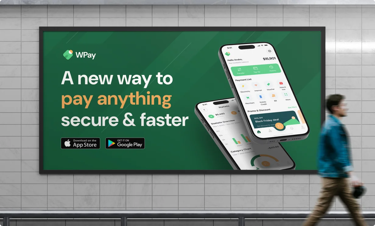
WPay is a digital wallet app designed for everyday transactions — from peer-to-peer transfers to budget tracking and bill payments. The goal was to position WPay as a smart, secure, and user-friendly alternative to traditional banking apps, with a visual identity and interface that feels both playful and trustworthy.
Fintech apps often struggle to balance usability with trust. WPay needed a design that felt secure, but also fun and engaging enough to appeal to a younger, mobile-first audience. The product had to look sharp, load fast, and guide users through complex flows without overwhelming them.
We developed a full brand identity and mobile UI system for WPay — focusing on intuitive navigation, friendly visual language, and high contrast for accessibility. The result is a product experience that simplifies financial actions while making them feel rewarding and easy.
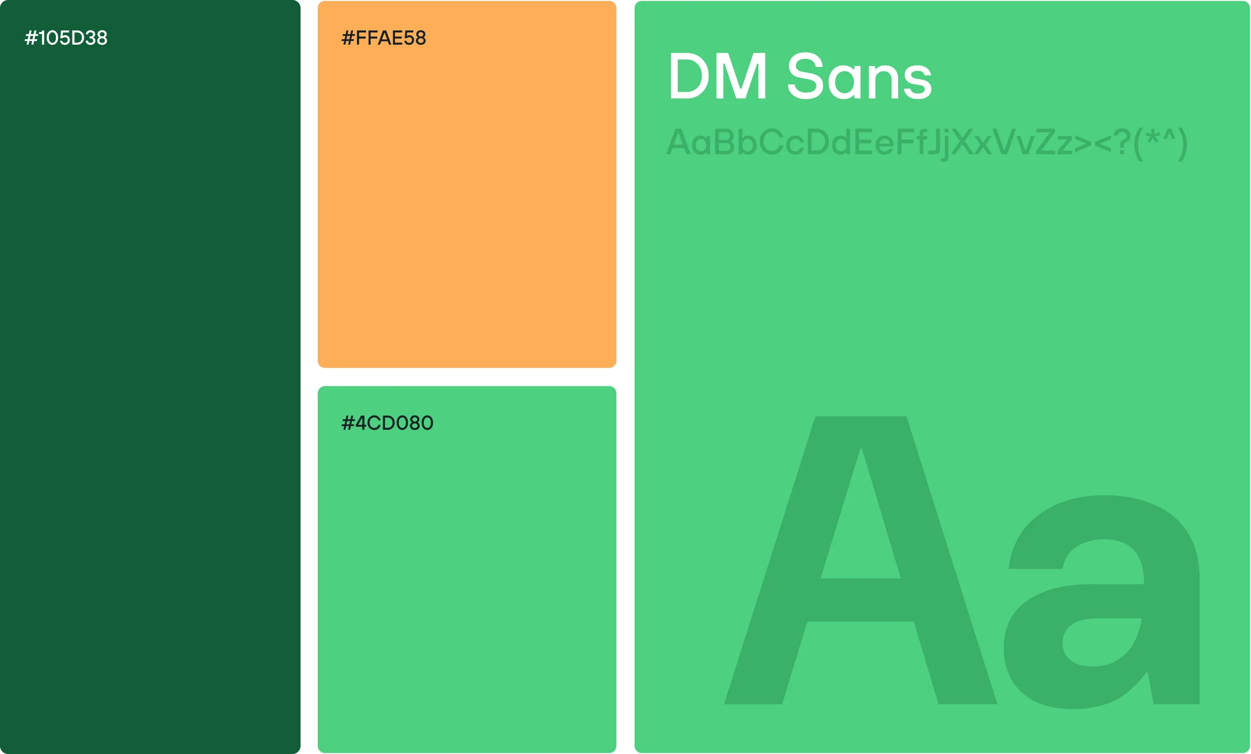
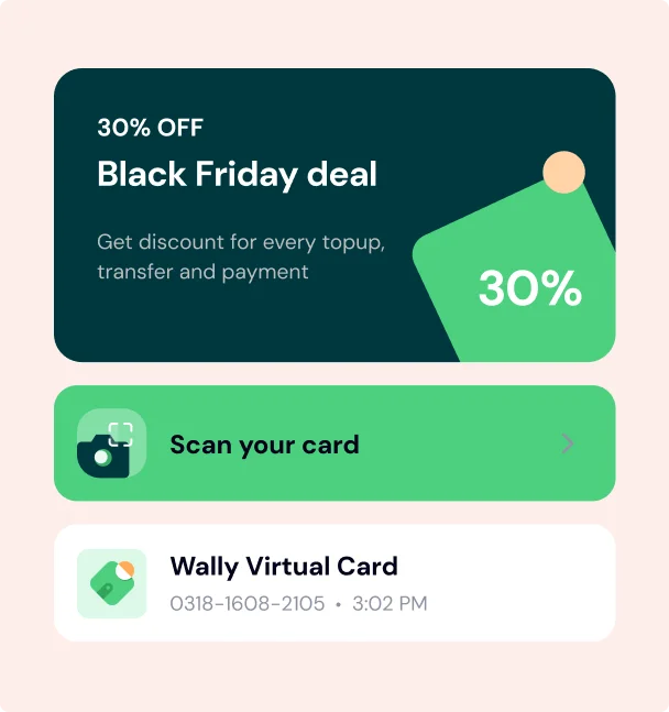
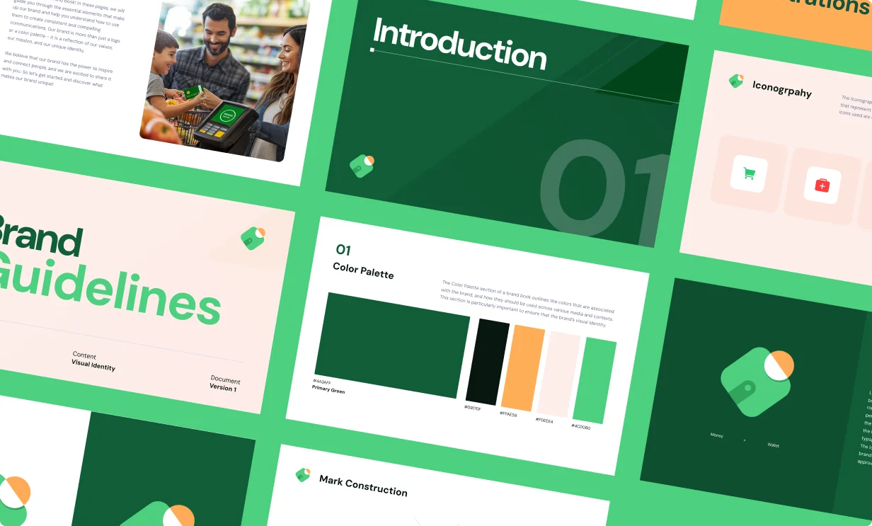
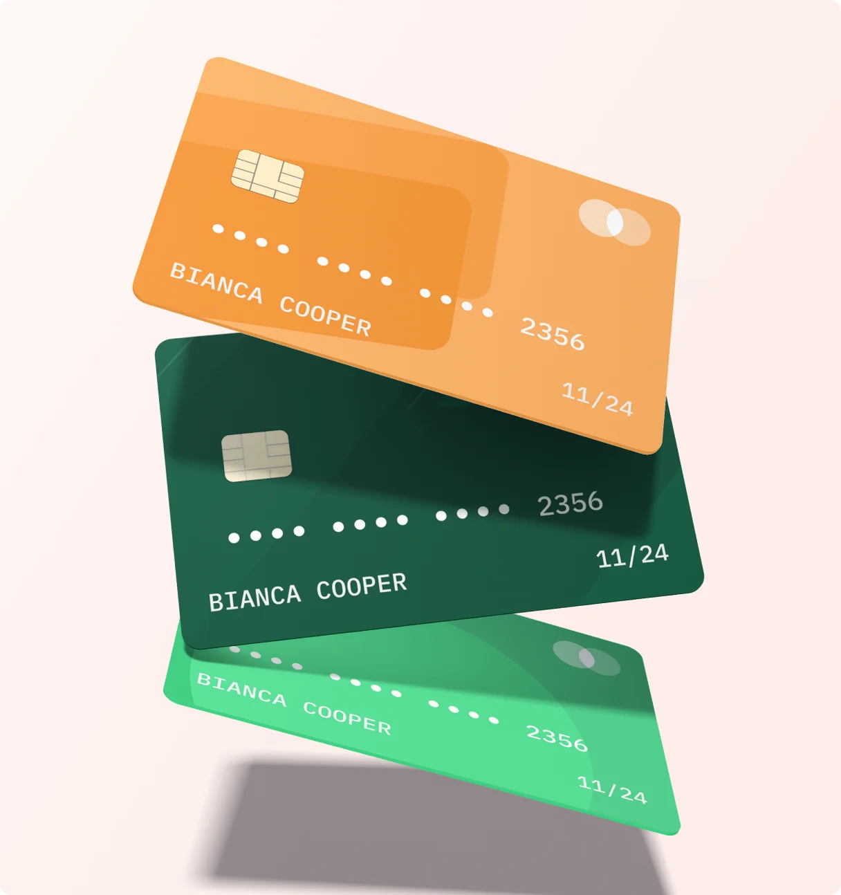
WPay’s visual system is centered on approachability and clarity. We created a bold, geometric icon and paired it with a vibrant green and peach color palette to signal freshness and energy. Typography and layout choices emphasize simplicity, while custom illustrations add personality to everyday interactions — reinforcing the brand’s goal of making finance feel less intimidating.

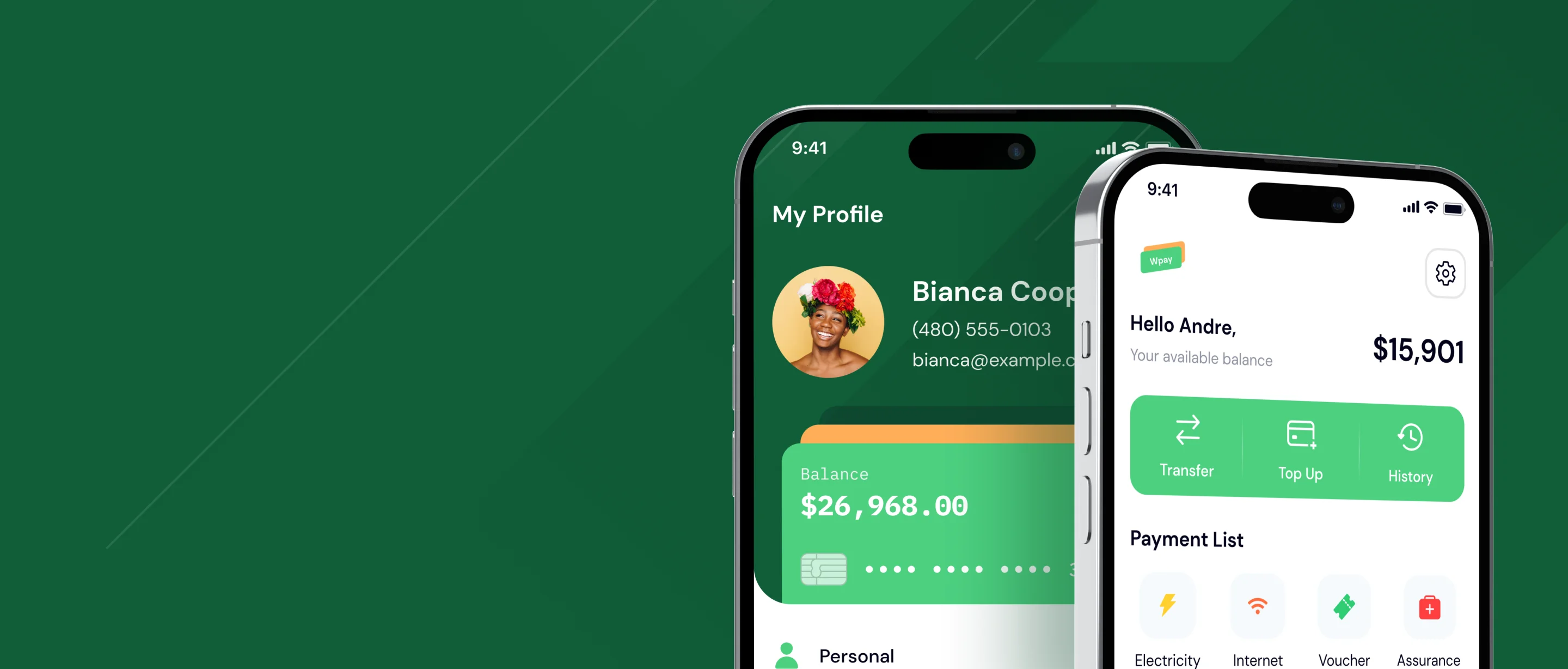
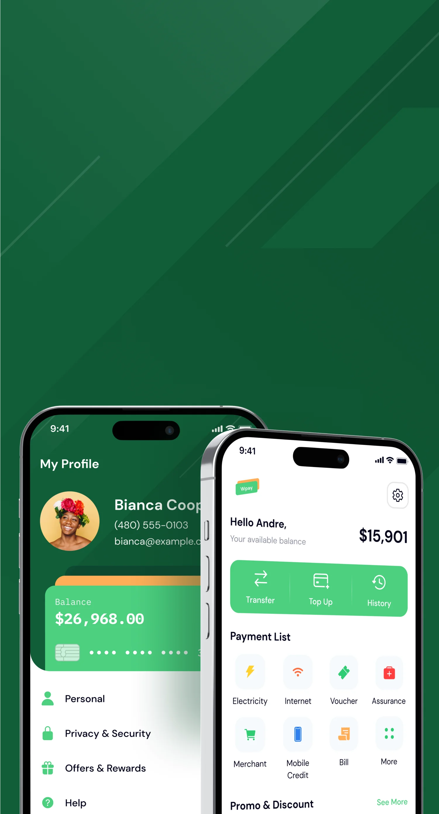
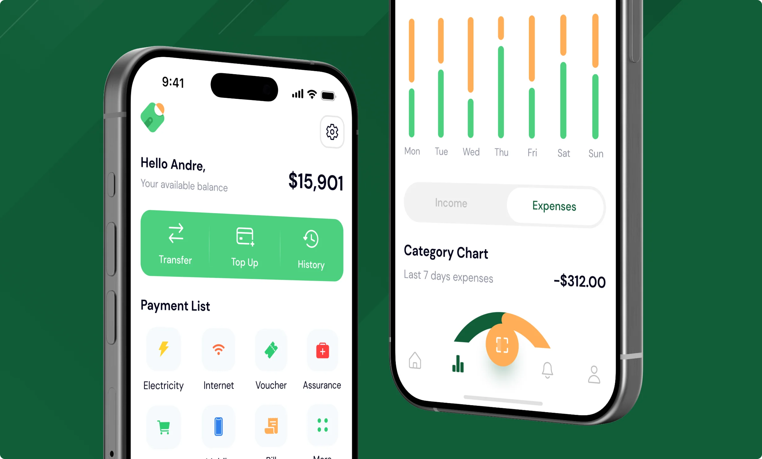
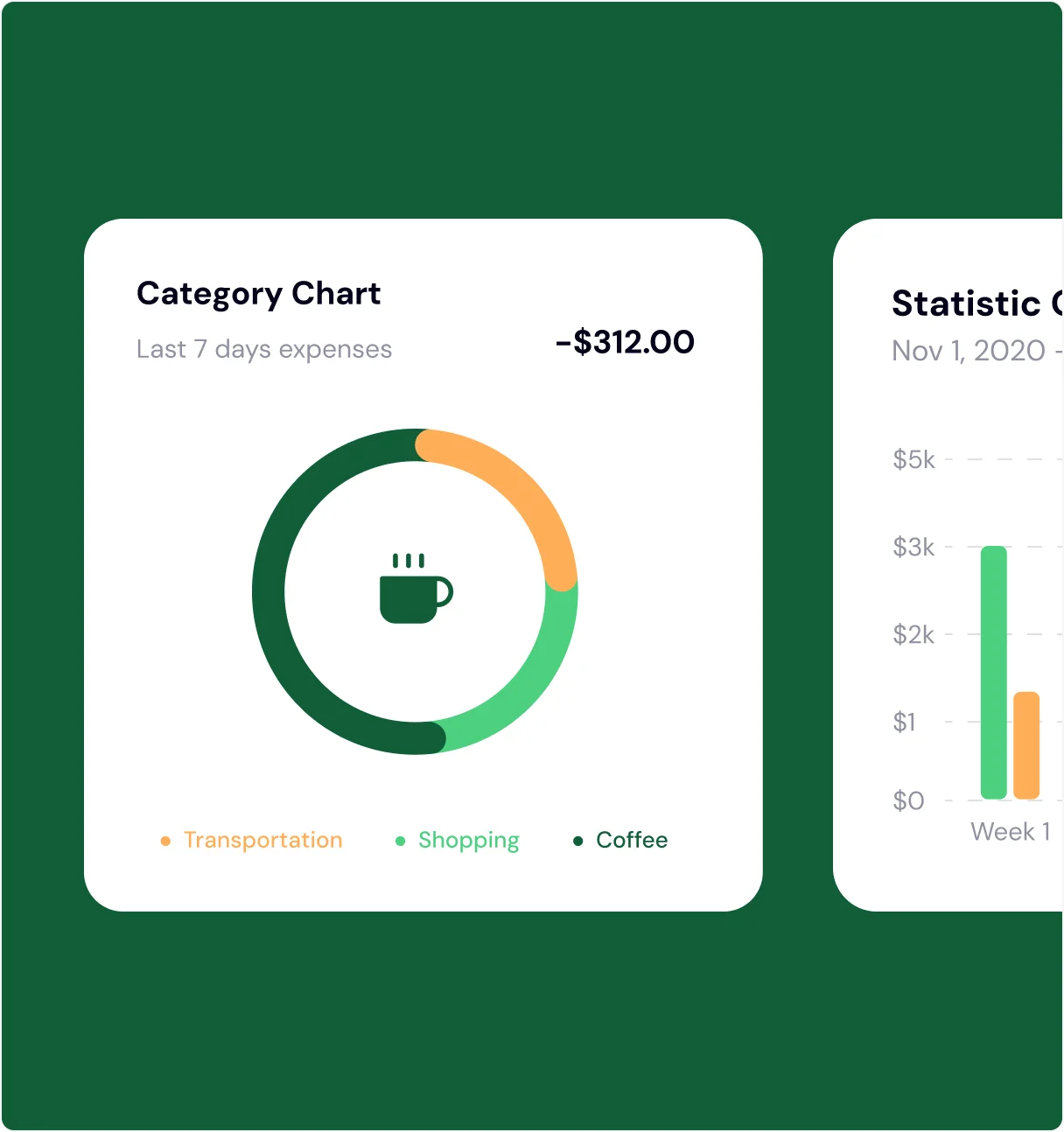
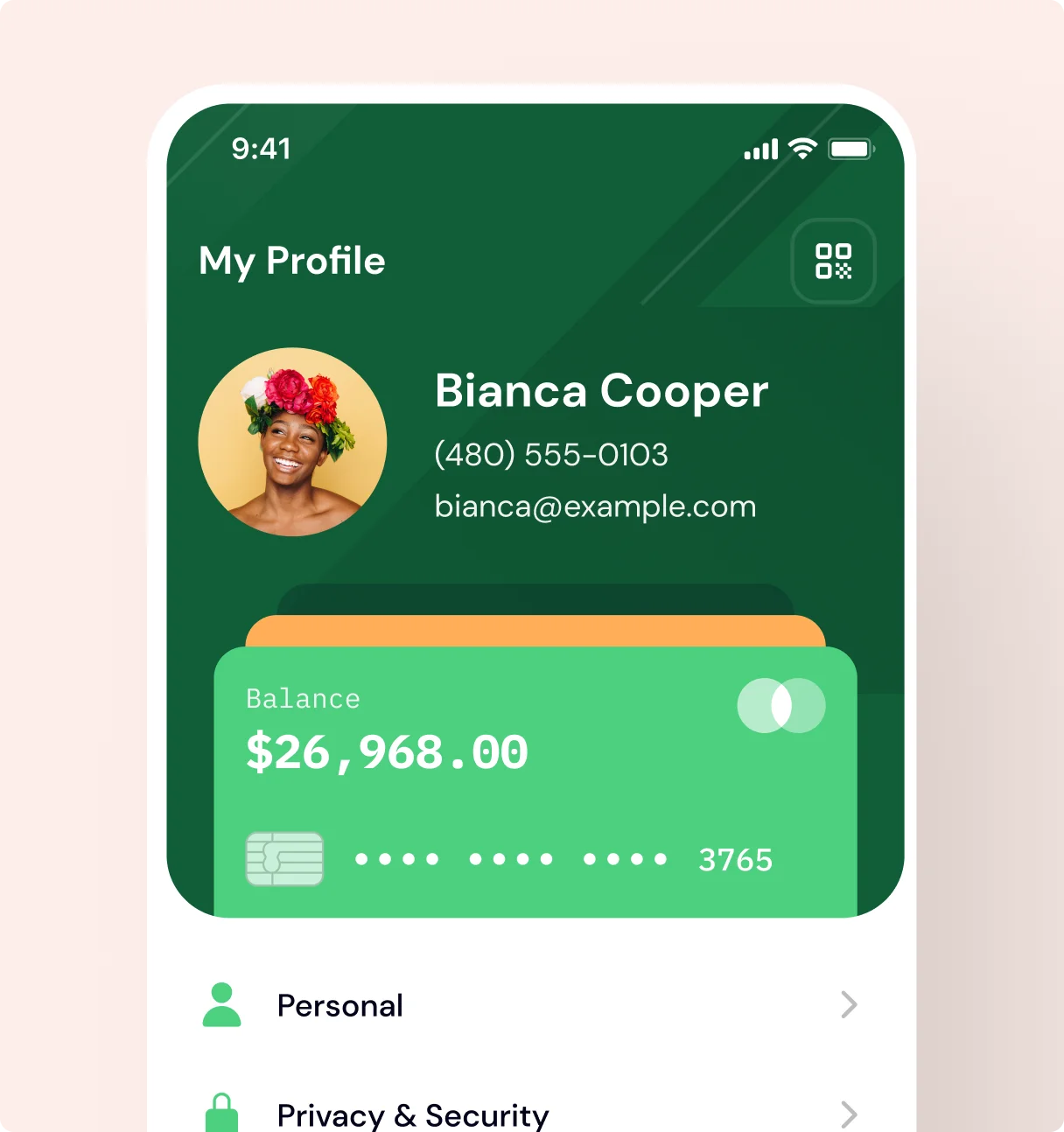
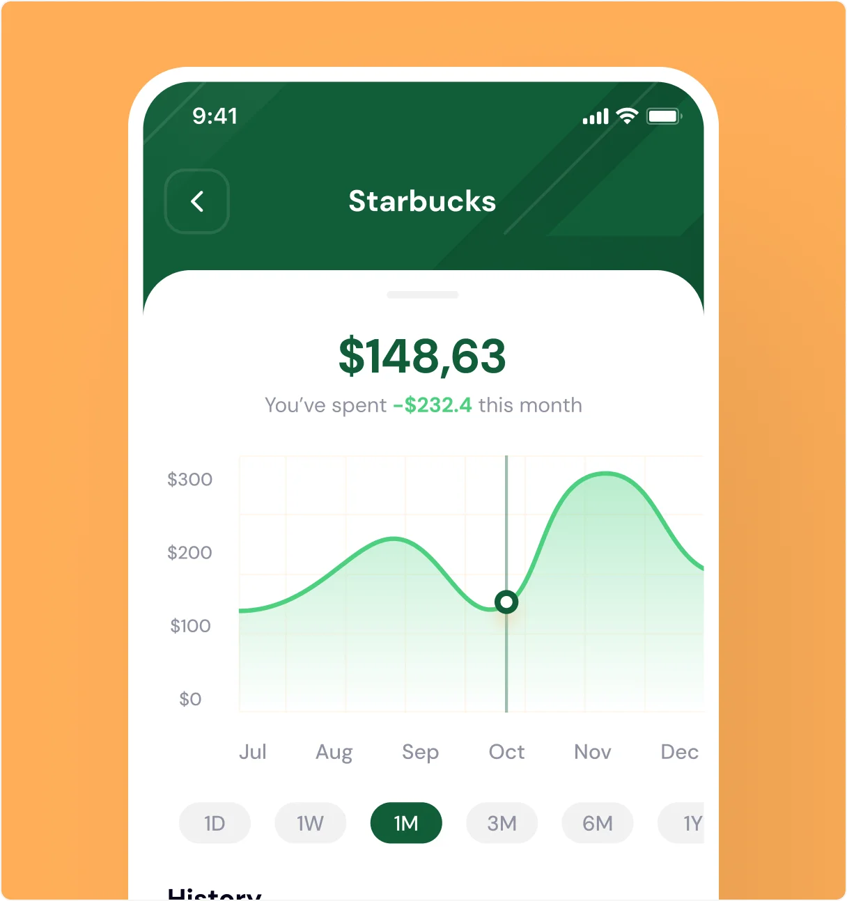
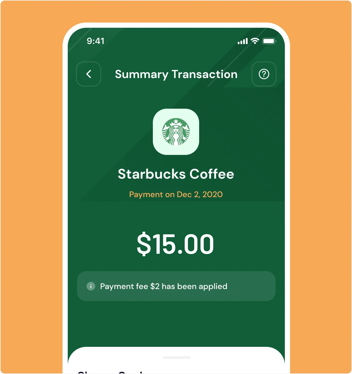
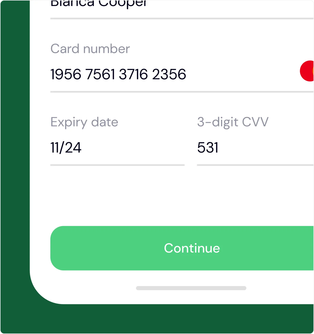
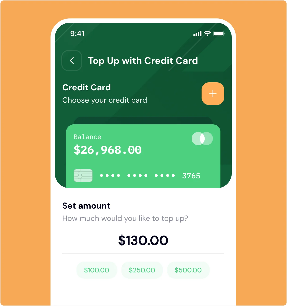
The core of the app includes balance overviews, spending analytics, transaction history, and peer transfers — all designed for clarity and speed. We focused on contrast, hierarchy, and clean data visualization to ensure users could check their financial health at a glance. Interactive flows like sending money or paying bills were built with quick taps and gentle motion to keep things feeling fast and frictionless.

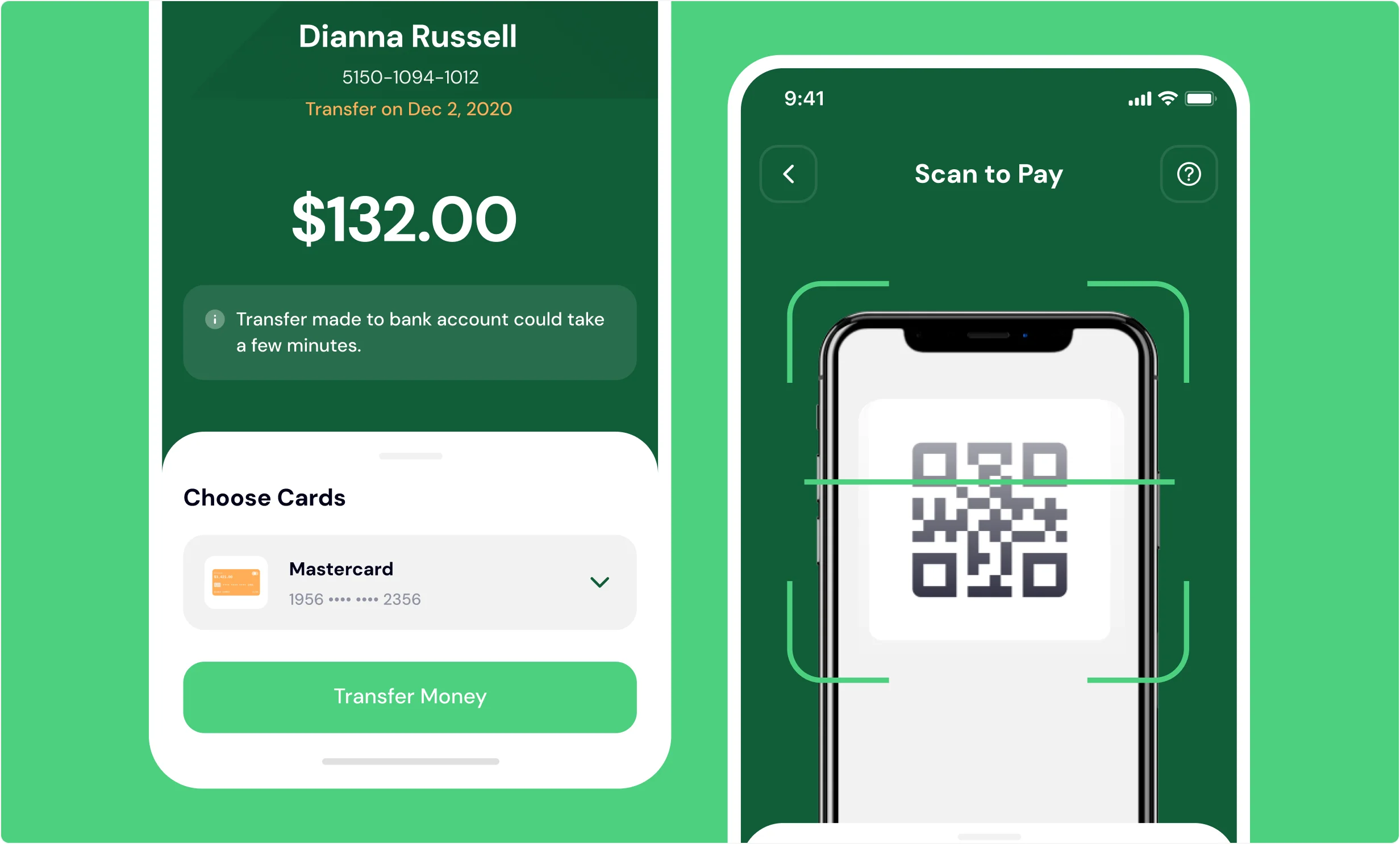
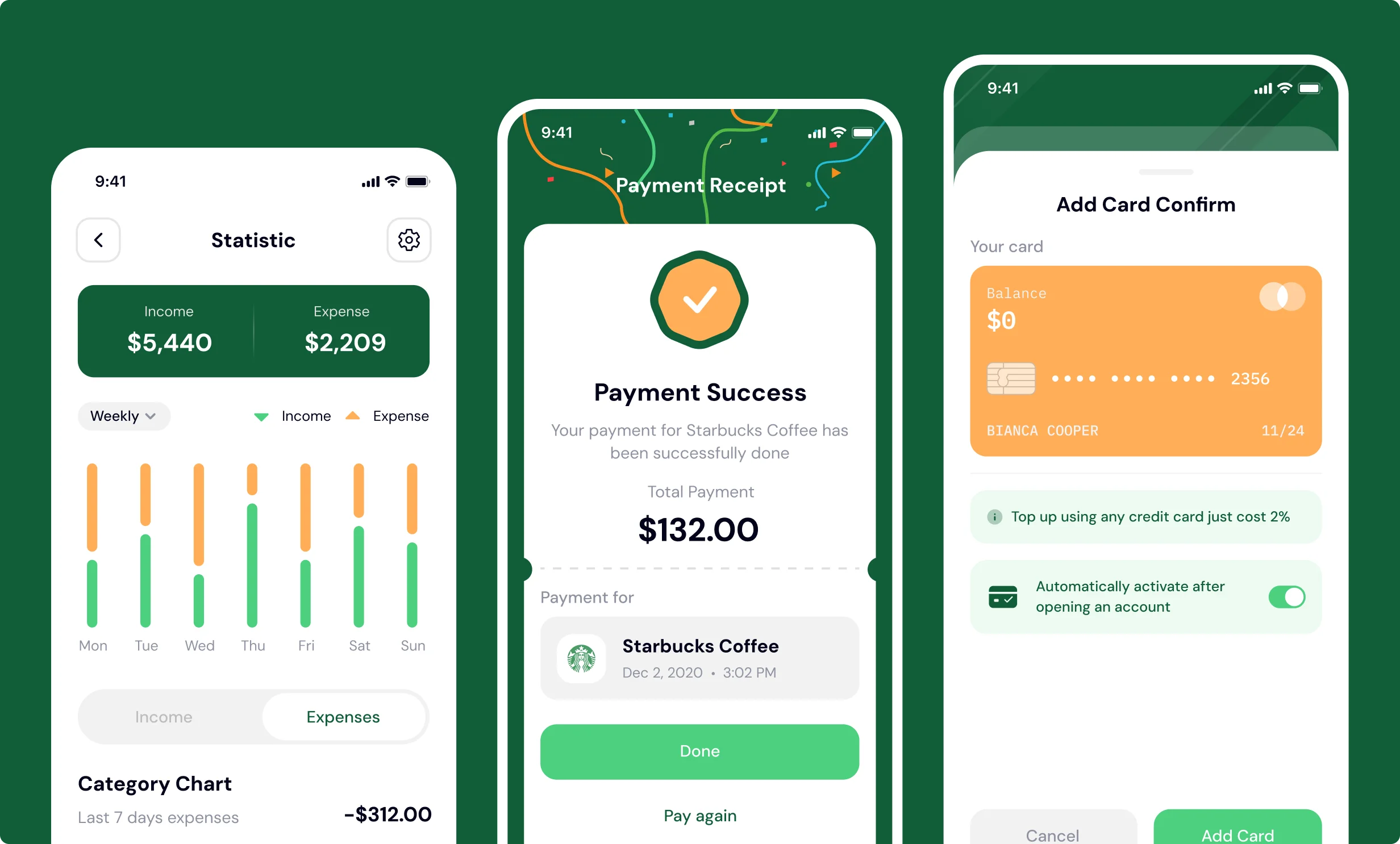
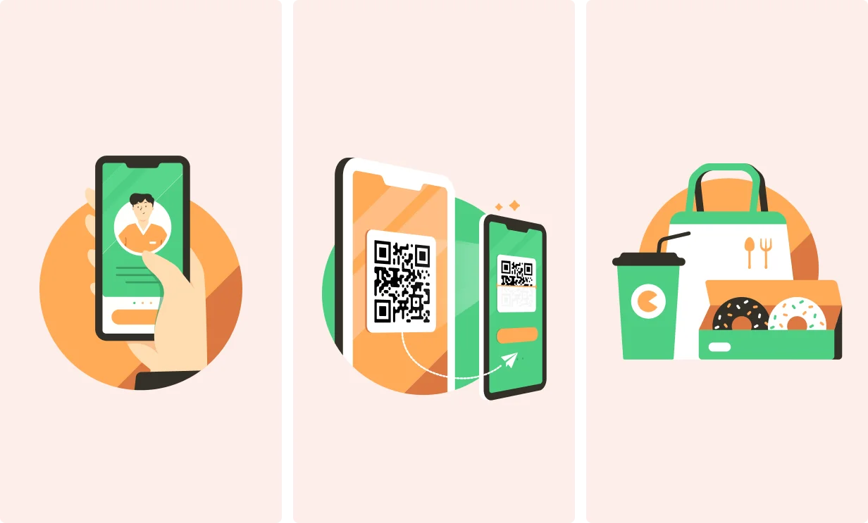
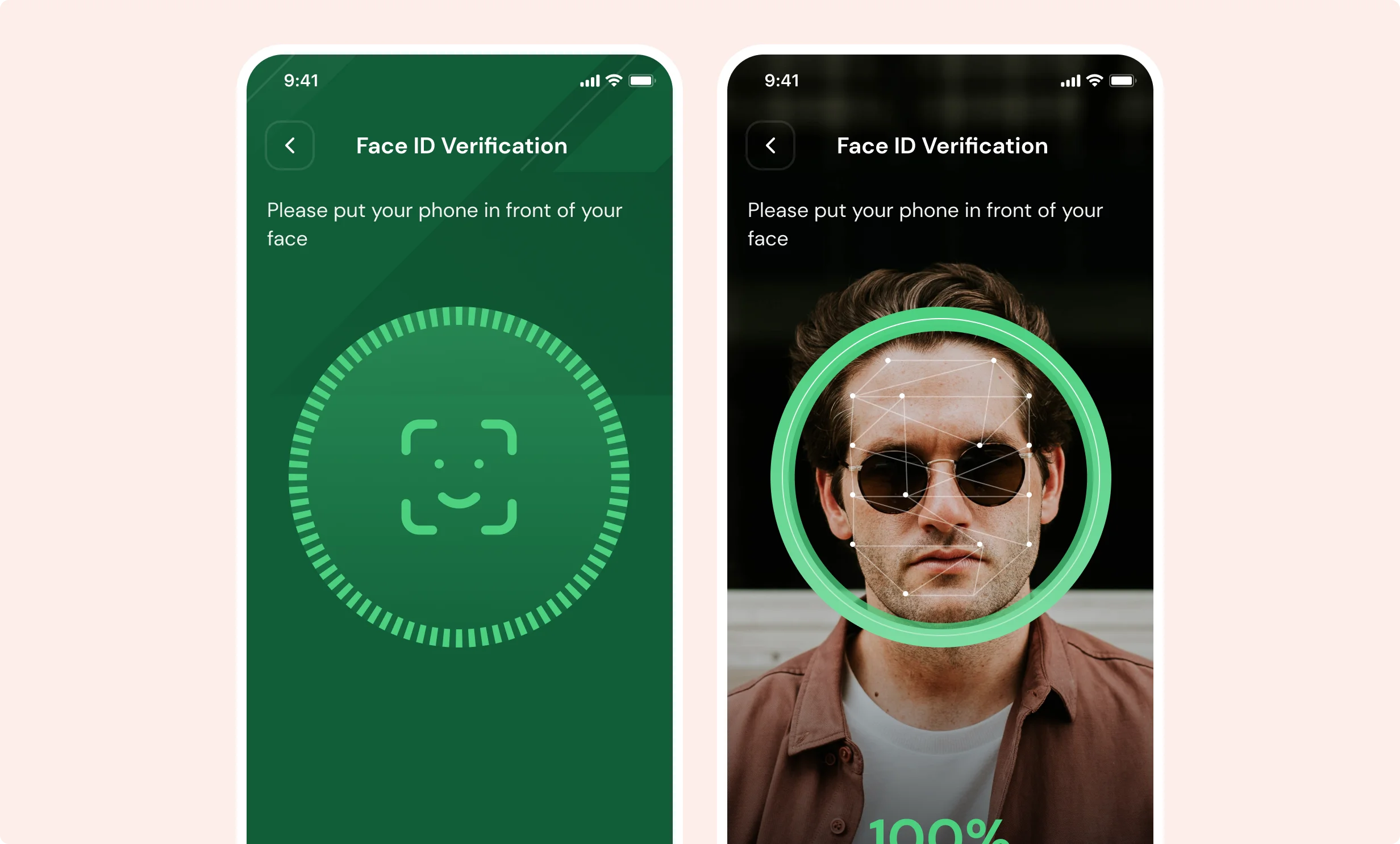
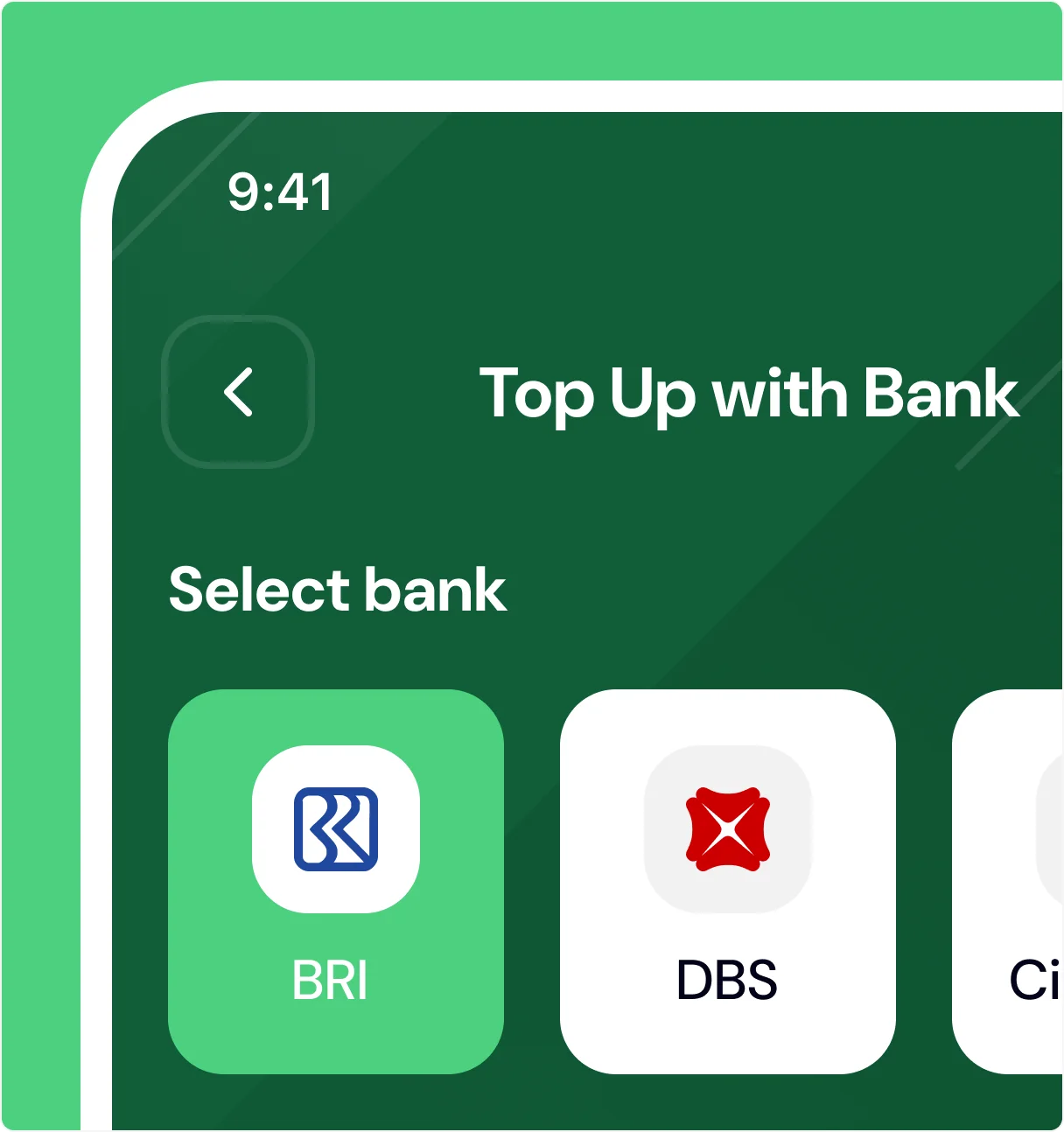
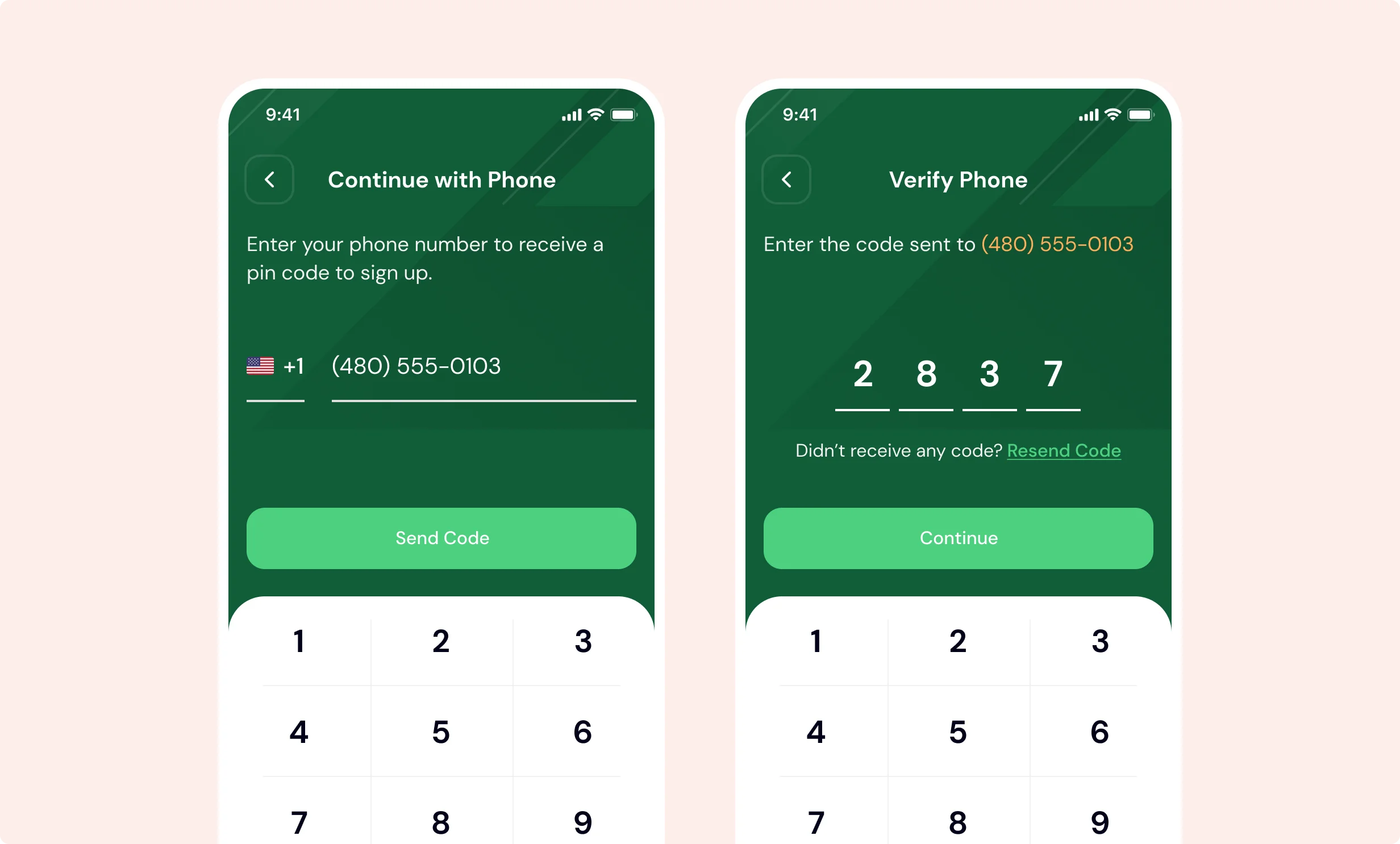
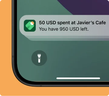
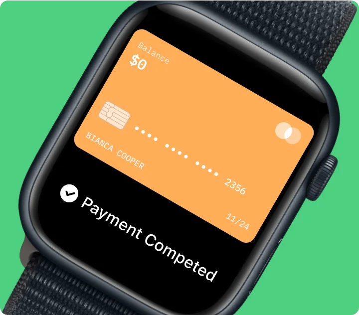
We designed key payment screens — including QR-based transfers, face ID login, top-up flows, and payment success confirmations — to feel both secure and delightful. Microinteractions and smart defaults help users complete tasks quickly while reinforcing a sense of confidence and control across the app.
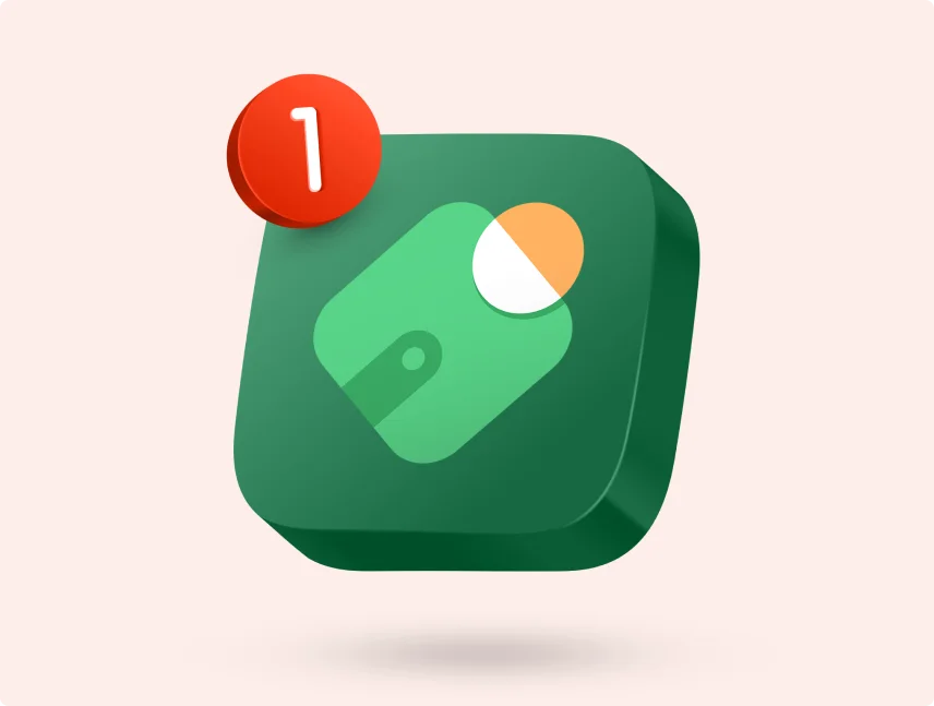
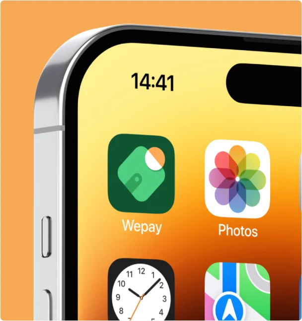
The WPay icon is a playful blend of wallet and tap — simple, confident, and instantly recognizable. Its bold green base ensures visibility across devices, while its clean silhouette scales smoothly from homescreen to App Store preview.

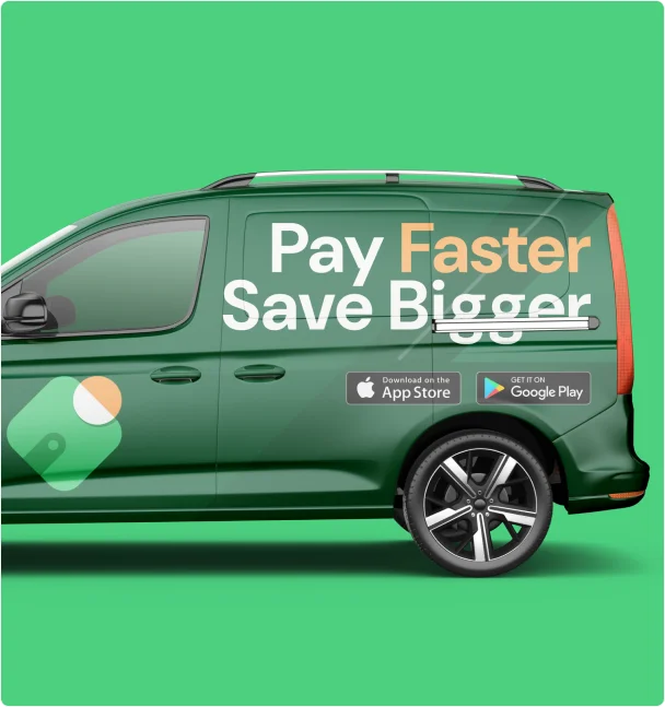
To round out the brand, we developed a series of marketing mockups, car wrap ads, and device stickers — extending the WPay identity across digital and physical touchpoints in a consistent and memorable way.
With a fresh identity and mobile-first design system, WPay is now positioned as a standout in the digital finance space. The product feels easier to use, more secure, and more delightful — helping users manage their money with more confidence, every day.
reduction in failed transactions through clearer UX
unique screens delivered and systemized
boost in daily usage during post-launch testing
improvement in onboarding completion after redesign
The new WPay feels fast, secure, and refreshingly easy to use.
“The Illiyin team understood our users right away. They created a design that feels fast, familiar, and fun — and it’s helped us stand out in a very competitive space.”
Zara Benali
WPay Co-Founder
Feel free to reach out if you want to collaborate with us, or simply have a chat.
Mostly available during 8AM - 8PM (GMT+7)
Our team will get back to you within 24 hours and you can also get in touch with our team via:


Seems like your submissions turns error. If you're not able to do another submission, you can get in touch with our team via: